Section Library
Sections for your pages, each with the usage snippet from the registry. Your coding agent composes pages from them with props. Names, quotes and numbers in the previews are fictional sample content.
Hero Sections
Eye-catching hero sections to make a strong first impression.
The previews below are layout ideas built with the same design tokens; they can differ from the default rendering of the registry component. Copy the component usage, or ask your agent to add a prop for a variation.
Registry component: Hero (src/components/sections/Hero.astro)
---
import Hero from "@/components/sections/Hero.astro";
---

<Hero
  badge={{ label: "Open source, MIT licensed", href: "/changelog" }}
  title="Build your site faster"
  subtitle="Start from ready-made sections and focus on your content."
  primaryCta={{ label: "Get started", href: "/docs" }}
  secondaryCta={{ label: "Browse sections", href: "/sections" }}
/>
Registry component: HeroSplit (src/components/sections/HeroSplit.astro)
---
import HeroSplit from "@/components/sections/HeroSplit.astro";
---

<HeroSplit
  tagline="Now in beta"
  title="Ship your product faster"
  subtitle="Pre-built components that just work."
  primaryCta={{ label: "Get started", href: "/docs" }}
  secondaryCta={{ label: "View demo", href: "/sections" }}
/>
Registry component: HeroGradient (src/components/sections/HeroGradient.astro)
---
import HeroGradient from "@/components/sections/HeroGradient.astro";
---

<HeroGradient
  title="Ship faster, look better"
  subtitle="Pre-built Astro components for ambitious teams."
  badge={{ label: "New release", href: "/changelog" }}
  primaryCta={{ label: "Browse components", href: "/sections" }}
  secondaryCta={{ label: "Read the docs", href: "/docs" }}
/>
Centered with Badge
Build amazing products faster
Start with our pre-built components and focus on what matters. Ship faster, iterate quicker.
Left Aligned with Visual
Ship your SaaS in days, not months
Everything you need to build a modern landing page. TypeScript, Tailwind, and shadcn/ui included.
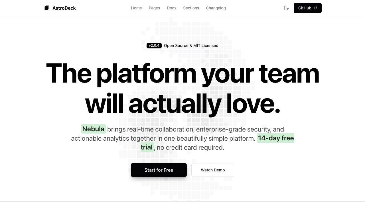
Minimal with Stats
The complete toolkit for modern development
Sample numbers for Nebula, a fictional product
Feature Grids
Three to nine benefits, each with an icon, a title and a short description.
The previews below render the registry component itself with sample props. Copy the component usage, or ask your agent to add a prop for a variation.
Registry component: Features (src/components/sections/Features.astro)
---
import Features from "@/components/sections/Features.astro";
---

<Features
  title="Why choose this starter?"
  subtitle="Everything you need to build fast"
  features={[
    { icon: "zap", title: "Fast by default", description: "Static HTML with minimal JavaScript." },
    { icon: "shield", title: "Type safe", description: "TypeScript props on every section." },
    { icon: "globe", title: "SEO ready", description: "Meta tags, sitemap and structured data." },
  ]}
/>
Icon Grid
Why teams pick Nebula
Everything in one place, nothing to stitch together
Real-time collaboration
Edit together and see changes as they happen.
Secure by default
Single sign-on and roles for every workspace.
Clear analytics
See what your team ships each week.
Content Blocks
A text block with an optional bullet list. With the image prop (a real photo or screenshot) it becomes two columns, as in the usage snippet.
The previews below render the registry component itself with sample props. Copy the component usage, or ask your agent to add a prop for a variation.
Registry component: ContentBlock (src/components/sections/ContentBlock.astro)
---
import ContentBlock from "@/components/sections/ContentBlock.astro";
import workshop from "@/assets/workshop.jpg";
---

<ContentBlock
  tagline="How we work"
  title="Every loaf is shaped by hand"
  description="We start the dough the evening before and bake from four in the morning."
  features={["Sourdough fermented for 18 hours", "Flour from a mill 30 km away"]}
  image={{ src: workshop, alt: "Baker shaping loaves on a floured wooden table" }}
  imageSide="left"
/>
Text Only
How it works
One workspace for the whole team
Nebula keeps plans, files and decisions in one place, so nobody has to ask where the latest version is.
- Shared boards for every project
- Comments next to the work
- Weekly summary by email
Logo Clouds
One row of logos with a leading label: your stack, or customers who agreed to be shown.
The previews below render the registry component itself with sample props. Copy the component usage, or ask your agent to add a prop for a variation.
Registry component: LogoCloud (src/components/sections/LogoCloud.astro)
---
import LogoCloud from "@/components/sections/LogoCloud.astro";
---

<LogoCloud
  title="Built with:"
  logos={[
    { name: "Astro", src: "/icons/tech/astro.svg", href: "https://astro.build" },
    { name: "Fast", icon: "zap" },
  ]}
/>
Single Row
Built with:



Integration Grids
Tools, integrations or partners as a grid of cards next to a short intro. Cards link out only when they have an href.
The previews below render the registry component itself with sample props. Copy the component usage, or ask your agent to add a prop for a variation.
Registry component: IntegrationGrid (src/components/sections/IntegrationGrid.astro)
---
import IntegrationGrid from "@/components/sections/IntegrationGrid.astro";
---

<IntegrationGrid
  title="Works with your tools"
  subtitle="Integrations"
  items={[
    { name: "GitHub", href: "https://github.com", subtitle: "Source control", icon: "code" },
  ]}
  cta={{ label: "See all integrations", href: "/docs" }}
>
  <p>Longer description shown under the title (optional slot).</p>
  <p slot="footer">Optional small print under the grid.</p>
</IntegrationGrid>
Two-Column Grid
Works with the tools you already use
Move data in and out of Nebula without waiting for us.
CSV import
Bring existing data
JSON export
Take your data anywhere
Webhooks
Trigger your own workflows
REST API
Build on top of Nebula
Call to Action
Convert visitors with compelling CTAs.
The previews below are layout ideas built with the same design tokens; they can differ from the default rendering of the registry component. Copy the component usage, or ask your agent to add a prop for a variation.
Registry component: CTA (src/components/sections/CTA.astro)
---
import CTA from "@/components/sections/CTA.astro";
---

<CTA
  title="Ready to get started?"
  description="Clone the repo and ship your first page today."
  cta={{ label: "Get started", href: "/docs" }}
/>
Simple Centered
Split with Features
Build faster with our components
- Pre-built components
- Full TypeScript support
- Dark mode ready
Banner Style
Try Nebula today
14 days free, no credit card required.
Pricing Tables
Clear pricing that converts.
The previews below are layout ideas built with the same design tokens; they can differ from the default rendering of the registry component. Copy the component usage, or ask your agent to add a prop for a variation.
Registry component: Pricing (src/components/sections/Pricing.astro)
---
import Pricing from "@/components/sections/Pricing.astro";
---

<Pricing
  title="Simple pricing"
  subtitle="Pick the plan that fits"
  note="Prices exclude VAT."
  tiers={[
    {
      name: "Free",
      price: "$0",
      description: "For side projects",
      features: ["1 project", "Community support"],
      cta: { label: "Start free", href: "/signup" },
    },
    {
      name: "Pro",
      price: "$29",
      period: "/month",
      description: "For teams",
      features: ["Unlimited projects", "Priority support"],
      cta: { label: "Subscribe", href: "/signup" },
      highlighted: true,
    },
  ]}
/>
Open Source Tiers
Free forever. Open source.
All features included. No hidden costs.
Landing Page
Everything you need for a stunning landing page.
- Hero & CTA sections
- Logo cloud
- Responsive design
Full SaaS
Complete boilerplate for your SaaS product.
- All landing page features
- Authentication layouts
- TypeScript & shadcn/ui
Open Source
MIT licensed and open for contributions.
- Full source code access
- Regular updates
- Commercial use allowed
Three Column Layout
Comparison Table
Choose your plan
Simple, transparent pricing
| Features | Free | Pro | Enterprise |
|---|---|---|---|
| Projects | 3 | Unlimited | Unlimited |
| Storage | 1 GB | 100 GB | Unlimited |
| Support | Community | 24/7 |
Monthly/Yearly Toggle
Flexible pricing
Save 20% with annual billing
Testimonials
Build trust with social proof.
The previews below are layout ideas built with the same design tokens; they can differ from the default rendering of the registry component. Copy the component usage, or ask your agent to add a prop for a variation.
Registry component: Testimonials (src/components/sections/Testimonials.astro)
---
import Testimonials from "@/components/sections/Testimonials.astro";
---

<Testimonials
  title="What customers say"
  testimonials={[
    {
      quote: "Replace this with a real quote you have permission to use.",
      author: "Your Customer",
      role: "Role",
      company: "Company",
    },
  ]}
/>
Grid Layout
"Nebula saved us weeks of development time. The components are beautiful and easy to customize."
Sarah Chen
CEO, TechCorp
"Best Astro boilerplate I've used. Clean code, great documentation, and excellent support."
Marcus Johnson
Developer
"The perfect starting point for any SaaS project. Highly recommended for anyone using Astro."
Emily Rodriguez
Product Manager
Featured Single
Nebula has completely transformed how we build landing pages. The quality of the components and attention to detail is exceptional. Our development time has been cut in half.
Alex Kim
CTO, StartupCo
Horizontal Scroll
"Game changer for our team!"
Jane Doe
Designer
"Excellent components and documentation."
Tom Peters
Engineer
"Best boilerplate for Astro projects."
Lisa Wang
Founder
FAQ
Answer common questions with an accessible accordion.
The previews below are layout ideas built with the same design tokens; they can differ from the default rendering of the registry component. Copy the component usage, or ask your agent to add a prop for a variation.
Registry component: FAQ (src/components/sections/FAQ.astro)
---
import FAQ from "@/components/sections/FAQ.astro";
---

<FAQ
  title="Frequently asked questions"
  subtitle="Everything you need to know"
  faqs={[
    { question: "Is it free?", answer: "Yes, it is MIT licensed." },
    { question: "Does it support dark mode?", answer: "Yes, all sections use theme tokens." },
  ]}
/>
Default Accordion
Frequently Asked Questions
Everything you need to know about AstroDeck
What is AstroDeck?
AstroDeck is a free, open-source starter kit for building websites with a coding agent. It ships typed, data-driven sections, a central site config, a theme script, checks and agent skills, styled with Tailwind CSS v4.
Is AstroDeck free to use?
Yes, AstroDeck is completely free and open-source under the MIT license. You can use it for personal and commercial projects without any cost or attribution requirement.
Does AstroDeck support dark mode?
Absolutely. Every component is built with CSS variables and Tailwind CSS, so dark mode works out of the box. Just toggle the class on the html element and all sections adapt automatically.
Can I use AstroDeck with an existing Astro project?
Yes. You can copy individual components into any Astro project. Make sure you have Tailwind CSS v4 configured via the @tailwindcss/vite plugin and the same CSS custom properties defined in your globals.css.
Stats
Highlight key metrics that build credibility.
The previews below are layout ideas built with the same design tokens; they can differ from the default rendering of the registry component. Copy the component usage, or ask your agent to add a prop for a variation.
Registry component: Stats (src/components/sections/Stats.astro)
---
import Stats from "@/components/sections/Stats.astro";
---

<Stats
  title="By the numbers"
  stats={[
    { value: "16", label: "Sections", description: "Ready to combine" },
    { value: "11", label: "UI components", description: "Built on Radix UI" },
  ]}
/>
Four-Column Grid
Nebula in numbers
Numbers that speak for themselves
- Teams
- 12K+
- Across 80+ countries
- Projects created
- 2M+
- And growing every week
- Integrations
- 40+
- With the tools you already use
- Uptime
- 99.9%
- Battle-tested infrastructure
Team
Introduce the people behind your product.
The previews below are layout ideas built with the same design tokens; they can differ from the default rendering of the registry component. Copy the component usage, or ask your agent to add a prop for a variation.
Registry component: Team (src/components/sections/Team.astro)
---
import Team from "@/components/sections/Team.astro";
---

<Team
  title="Meet the team"
  members={[
    {
      name: "Your Name",
      role: "Founder",
      bio: "One sentence about this person.",
      social: { github: "https://github.com/your-handle" },
    },
  ]}
/>
Card Grid with Initials
Meet Our Team
The people building Nebula
Alex Rivera
Co-Founder & CEO
Passionate about developer experience and open source.
Sam Chen
Lead Engineer
TypeScript enthusiast and Astro core contributor.
Jordan Lee
Design Lead
Crafting accessible interfaces with Tailwind and shadcn/ui.
Comparison
Show how you stack up against the competition.
The previews below are layout ideas built with the same design tokens; they can differ from the default rendering of the registry component. Copy the component usage, or ask your agent to add a prop for a variation.
Registry component: Comparison (src/components/sections/Comparison.astro)
---
import Comparison from "@/components/sections/Comparison.astro";
---

<Comparison
  title="How we compare"
  columns={[{ name: "Us", highlighted: true }, { name: "Alternative" }]}
  features={[
    { name: "Open source", values: [true, false] },
    { name: "Updates per year", values: ["Unlimited", "4"] },
  ]}
/>
Feature Comparison Table
How We Compare
See why teams choose Nebula over the alternatives
| Feature | NebulaRecommended | Competitor A | Competitor B |
|---|---|---|---|
| Open source | |||
| TypeScript support | |||
| Dark mode | |||
| Tailwind CSS v4 | |||
| Updates per year | Unlimited | 12 | 4 |
Contact
Let visitors reach you with a clean contact form.
The previews below are layout ideas built with the same design tokens; they can differ from the default rendering of the registry component. Copy the component usage, or ask your agent to add a prop for a variation.
Registry component: Contact (src/components/sections/Contact.astro)
---
import Contact from "@/components/sections/Contact.astro";
---

<Contact
  title="Get in touch"
  subtitle="Questions or feedback? Write to us."
  email="hello@example.com"
  form={{ action: "https://your-form-backend.example/submit", method: "post", submitLabel: "Send message" }}
/>
Split with Form
Get in Touch
Have a question or want to contribute? We would love to hear from you.
Email
hello@example.comPhone
+1 (555) 000-1234Address
123 Developer Lane
San Francisco, CA 94107
United States